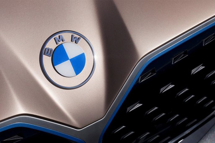
At a virtual press conference yesterday, BMW not only presented the new concept car i4, but also a new brand design. The new logo appears lighter and in the future will, among other things, do without the black ring that the logo has shaped since 1917. As we all know, the full German name of BMW is “Bayerische Motoren Werke”. The blue and white pattern on its logo is the blue and white grid inspired by the Bavarian flag. The rest is completely overhauled.
Approximately in the middle of the virtual presentation, which is broadcasted live on the Internet – the world premiere should have been at the Geneva Motor Show – the new logo flashes for the first time. Among other things, it is more transparent, the traditional black ring is missing and the blue looks a bit brighter.

The new brand appearance will mark a new era in mobility. Jens Thiemer (BMW brand management and marketing department): “BMW is becoming a relationship brand. The old black ring was replaced, letting the new logo radiate more openness and clarity. We want to use this new transparent version to invite our customers, more than ever, to become part of the world of BMW.
From now on, the new BMW logo will do without color gradients, 3D shading and gloss effects. BMW is thus following a trend that numerous other automobile manufacturers have already followed in recent years. Most recently, the Volkswagen car brand received a flat, two-dimensional logo. Mini was, however, the first well-known car brand to take this path towards a simplified design language; followed by Audi , Citroen , Seat , Opel , and many other car brands.
The new brand identity was developed together with the BECC Agency Munich. Basically, the new BMW brand design is intended for communication (online and offline) with a focus on the digital presence of the brand.

Whether you like the new logo better than the old one remains a question of personal taste.
But, is the logo BMW’s biggest problem right now?


