
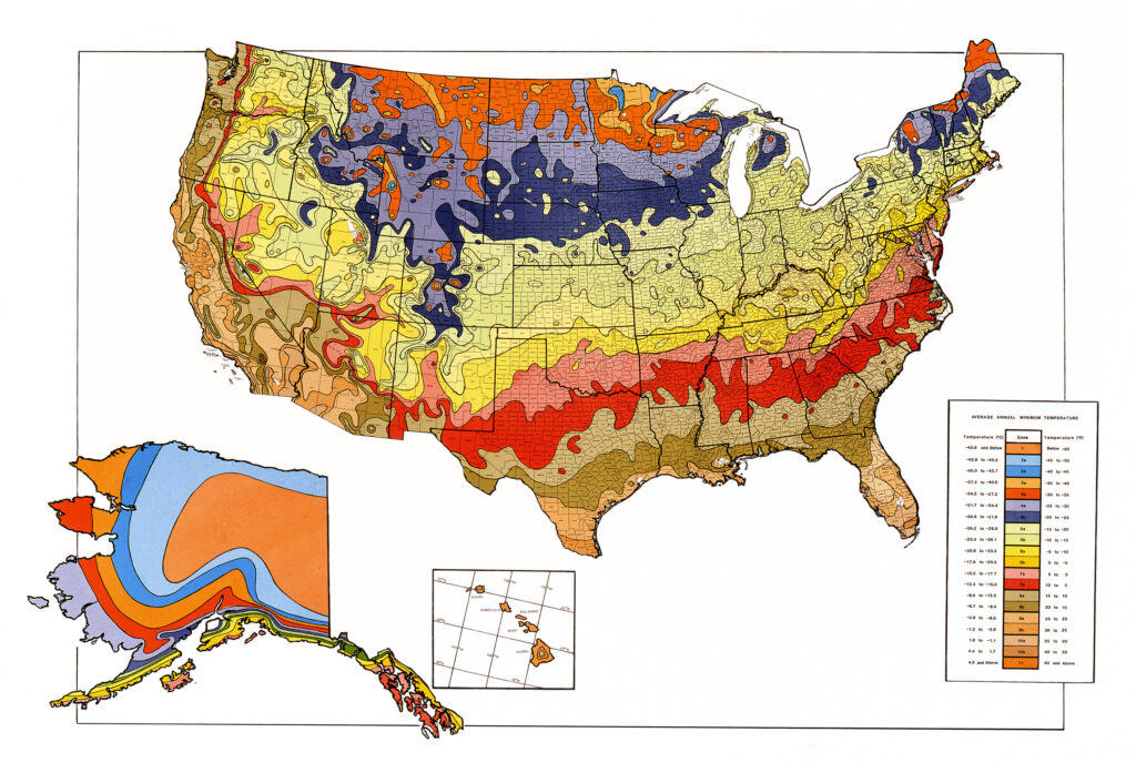
Most gardeners know what hardiness zone they live in and strive to buy plants and seeds that will grow in that zone. Plant hardiness zones represent the average annual extreme minimum temperatures at a given location during a particular time period. These annual extremes are very important in telling what plants will survive the cold in a given zone or will freeze to death. Did you ever wonder how the hardiness zones came to be? It is an interesting story that begins during the Great Depression.
Two researchers at two different agencies thought of making a map to guide farmers as to what crops would grow best in their area. Before the USDA hardiness zone map, most farmers were guided by family traditions of the Farmer’s Almanac.
During the Depression, the U.S. National Arboretum decided to work on a map that would divide the United States into zones that were separated by ten degrees Fahrenheit. The other researcher, Donald Wyman of the Arnold Arboretum, was working on a map that was divided into eight zones that could have a temperature difference of five, ten, or fifteen degrees.
In 1938, Wyman released the AA Plant Hardiness Zone map. The zones were so broad that it was difficult for people to use. In 1960, Henry Skinner of the U.S. National Arboretum published his hardiness zone map. Gardeners liked the Skinner map better because it was divided based on ten degree gradations in temperature and was easier to use. The two maps did not agree about the zones, but gradually gardeners gravitated to the US National Arboretum map.
In 1965, the USDA Plant Hardiness Zone Map was updated and data from Florida was added to the map. In 1978, the Wyman map was updated but by 1990 it had fallen out of favor due to the difficulty of use. The USDA map became the standard that gardeners used to tell when and what to plant.
By 1990, the USDA map was no longer as accurate as it had once been. It was updated and the zones changed to reflect the climate changes that were happening. H. Marc Cathey revised the map to reflect these changes in climate and added Mexico and Canada to the map. The map kept the ten degrees zones but broke each zone into two five degree zones labeled “a” and “b”.
In 2002, politics reared its ugly head. The map needed to be updated because the hardiness zones were moving northward. The American Horticultural Society was willing to do the updates but political pressure kept the map from being published. It was feared that the new map would give credence to the idea of global warming.
In 2006, the Arbor Day Foundation put out a map that showed that climate zones had shifted significantly north from 1990 to 2006. This implied the climate was warming.
In 2012, the USDA map was updated to add two new climate zones. No mention was made of global warming at that time. This map was developed with the cooperation of the Oregon State University and the USDA.
The new map has shifted zone boundaries for many locations. In general, the map has shifted one five degree zone to the north. USDA claims this is the result of using data that is more accurate. It also used thirty years of data instead of thirteen years of data as the 1990 map did.
Some of the changes were the result of methods that are newer and more sophisticated than the 1990 map. These include factoring in changes in elevation, nearness to large bodies of water, and the position of terrain such as valley bottoms and ridge tops. This allowed the cartographers to map a much more accurate map, especially in the mountainous areas in the western United States.
While the map data is primarily used by American gardeners, including wholesale and retail outlets that grow plants, it has other uses as well. Scientists use the zones while modeling the spread of exotic weeds and insects. Crop insurance agencies use the information in their determination of what crops will be insured, when and where.
In 2015, the Arbor Day Foundation released an updated zone map. This map was based upon data from 5,000 National Climatic Data Center cooperative stations across the continental United States.
Zone maps focus on average minimum temperatures, but do not show anything about average high temperatures. This can be a real problem for gardeners because plants that can handle the cold may not be able to handle the heat in a given location. The USDA has not addressed this problem.
Further, plants in the same zone may not survive because of other factors, such as humidity, water dependence, and sunlight needs. For example, Kiwi trees, which produce Kiwi fruit, are in the same zone in their native habitat as North Central Texas. However, Kiwi trees live in a tropical rainforest and have big leaves with large open pores to absorb the rain. In Texas, the open pores allow water to escape from the plant faster than the roots can supply it. That means the Kiwi trees die of dehydration in Texas even though the zones of the two locations were exactly the same.
To address these concerns, the American Horticultural Society has developed a heat zone map. It looks similar to the USDA hardiness zone map, but the temperatures are highs for the areas displayed, not lows.
This heat zone map is slowly being accepted and used by nurseries to code their plants’ heat tolerance as well as their cold tolerance. This map allows one to see at a glance if the plant can handle the range of temperatures, cold and hot, that characterize your location.
The heat zone map is located on the Arbor Day website. There is also a good summary of how to use the map to make sure that your plants can survive the summer as well as the winter in your location.


